Quote:
Originally Posted by AgStacker


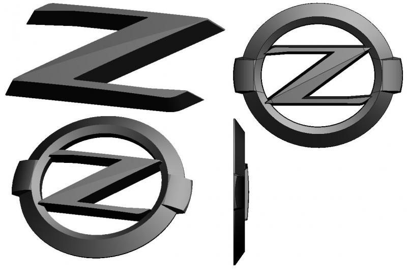
Interesting... Looks like we might not have to give up on the #0 design after all, at least for the front. We might be able cover the two nubs with the ring. What about covering the square with a small, low, color matched piece thats connected to the diagonal section of the z |
By #0 do you mean this one?

If I have something that connects to the diagonal section of the letter Z what shape should I make? Because I don't think a small rectangle going side ways will look good....cuz we're now back to the hamburger style or have people mix up with it looking like the old school Z logo....
Ahh, nevermind...i see the pics now
hmm...i dunno....i personally wouldn't go with that design but I'll let others vote.
I noticed you took a pic with the camera, wouldn't a print screen be faster?