Quote:
Originally Posted by Wheels3309

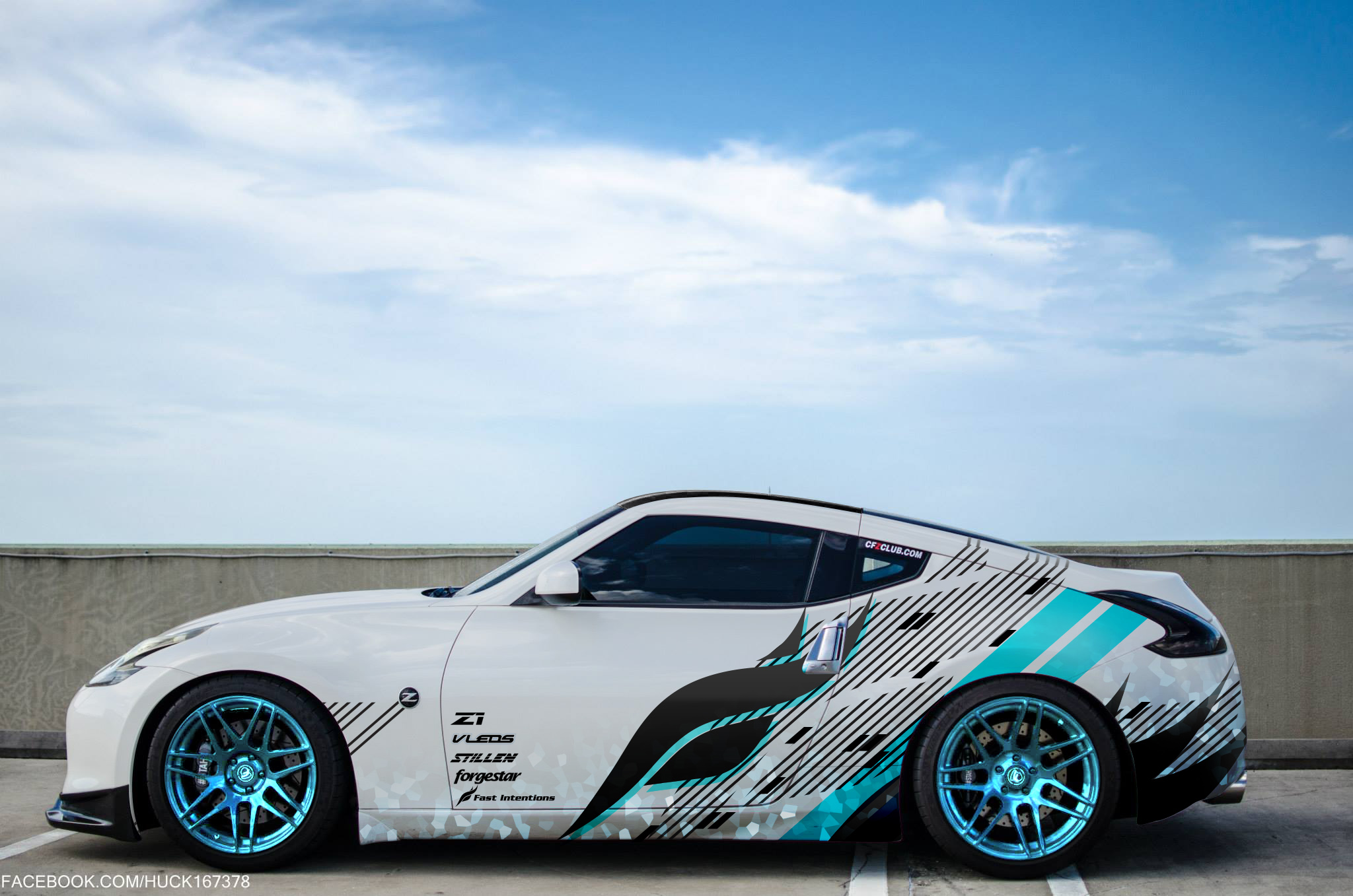
Huck, Here's a couple options... honestly you could do a millions variations... it'd be nice to get a feel for what style your looking for.... like if you don't dig something just give me some direction and we can modify... like, simpler vs. more detailed, color change from front to back vs. solid color, no sponsor logos, more organic, more tech, etc... 
 Huck_white_01 Huck_white_01 by mike.wheeler.3532, on Flickr
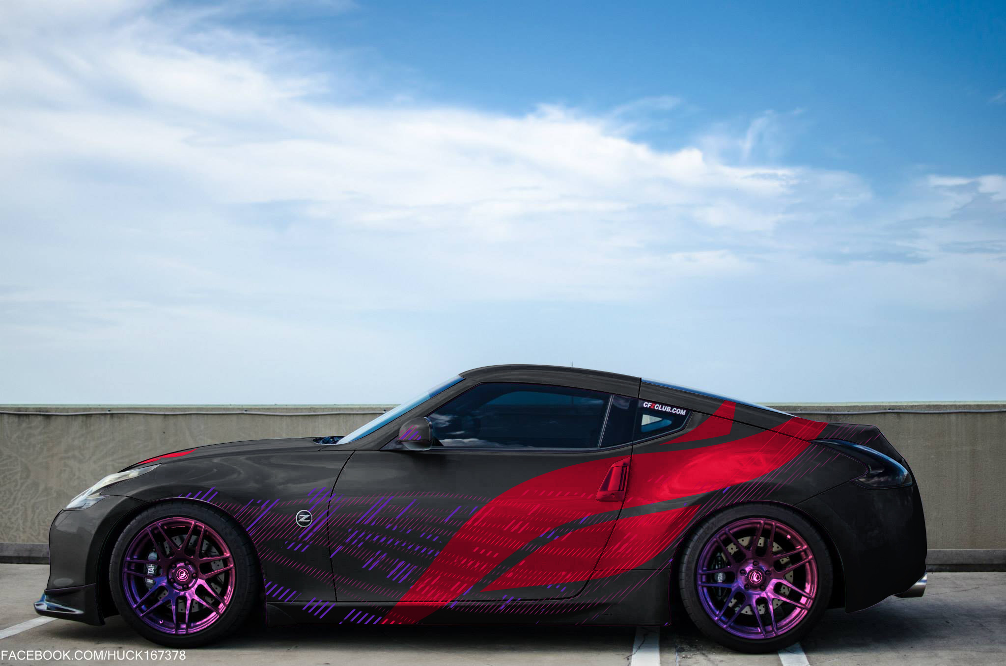
 Huck_black_02 Huck_black_02 by mike.wheeler.3532, on Flickr |
Obviously I love white and black contrast, those are my two favorite colors so I like this design alot. Also adding in a little blue to break it up looks nice, but maybe a few less black lines to make it not quite so busy. On the second one I love the size of the logo, hell, it could even go a little bigger. I would get rid of the tiny little lines though. I'm thinking if something simple, maybe flowing? Does that make sense? Although I really wouldn't complain having any of this on my car, so far I've liked all the ideas a lot.
As I've said before, you guys are the bomb. I wish I knew how to do this so I didn't have to bother you guys about it. I know the basics of Photoshop, but I can't sit there and take classes on the stuff, I learn by doing. I downloaded Photoshop and lightroom and just started clicking buttons to see what happened lol. That's pretty much how I learn everything, I just start experimenting. I need to sit down and learn the more in depth stuff.
Quote:
Originally Posted by ZAtlanta_OG

Huck, Just messing around.


-Dante |
I like the simplicity of the first one, minimalist designs are nice. The second one I like the color change on the rear of the car, although I'd probably go with a different color. I wouldn't want to do the wheels the same exact color as the wrap, I want the wheels to provide some contrast to the color scheme, but something that matches if that makes sense.
Quote:
Originally Posted by ZAtlanta_OG

Huck and a go at that purple, hard to get the same effect.

 |
I like the first one but I'd do it red. It's hard to tell from the pic of the wheels I uploaded but they're actually a color shift from black to red. Basically red wheels with a metallic black that shines through with the light. The second one, I like the flat/matte black look a lot, with a red logo. I could also see some thin white lines for a minimalistic look, maybe schematics/blueprints of a part? Idk, I suck at this lol. I see stuff in my head but it's hard for me to explain it our visualize it enough to communicate what I'm thinking.
Sent from my Nexus 6P using Tapatalk