Quote:
Originally Posted by bullitt5897

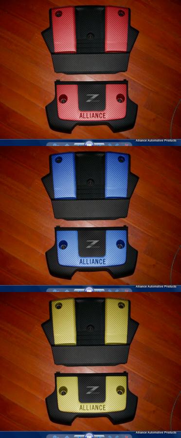
Like I posted in my350 "I think the cover should be raised to match the silver sections like you had mentioned. Except I would leave the Nissan hamburger out of the design and put a raised Z logo instead." Giving the option to have these color matched will be a big plus!
Here is an Idea to throw around guys:
 |
I LOVE this idea and would pick one up. I especially like the red with the Z logo. If you could do the color portions in CF and the black portion more a flat finish (heck, even flat black on CF would look great), I think you have a winner.